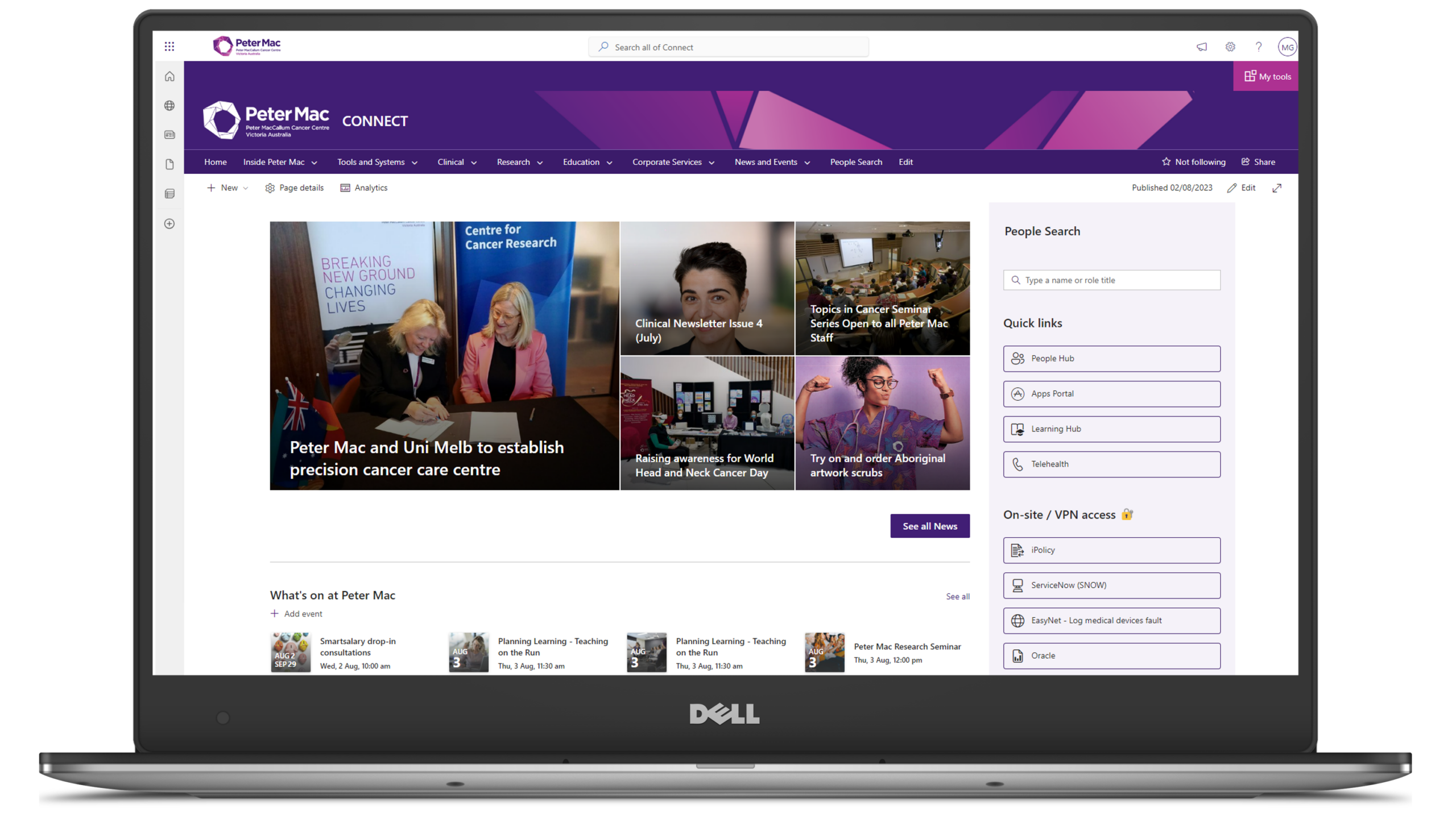
Peter MacCallum Cancer Centre ‘connects’ with double the number of staff thanks to SharePoint Online intranet
Peter MacCallum Cancer Centre (Peter Mac) is a world leading cancer research, education and treatment centre and Australia’s only public health service solely dedicated to caring for people affected by cancer.
Client
Peter MacCallum Cancer Centre
Industry
Healthcare
Organisation Size
3,500
Country
Australia
Technologies
SharePoint Online
Context
Built on Drupal, Peter Mac’s intranet known as ‘Connect’ was the internal facing communications tool, where staff across multiple departments could find company news, information, and documents to help them perform their job.
Peter Mac’s vision was to reinvigorate Connect to better support the business and to develop a positive, personalised, and intelligent digital employee experience. To create this, they wanted to implement a ‘single source of truth’, communication, information and collaboration platform which reflected their vision:
“An accessible and dynamic digital employee experience for everyone at Peter Mac, creating a one stop shop for information, news, and content. Connect would be the hub for all things Peter Mac.”
With hundreds of intranet projects under our belt and proven success in solving similar issues, our Digital Workplace practice was brought on board to take on the challenge of moving Connect to SharePoint Online.
Challenge
Peter Mac’s 3,500 staff including more than 750 laboratory and clinical researchers all have the same focus – to provide treatments, care, and cures for cancer patients at the most vulnerable times of their lives. This means technology needs to help, and not hinder how they work.
Peter Mac’s previous intranet, Connect, was built to provide access to need-to-know organisational information and crucial documentation and act as a hub for news and event updates. However, Connect was quickly becoming hard to use and out-of-date, with poor information architecture (IA) and search capabilities.
Peter Mac had already begun rolling out Microsoft 365 as part of their digital transformation journey and used this as an opportunity to reimagine what rebuilding Connect could look like on SharePoint Online. Their goal was to create a ‘digital front door’ that would be modern, organised, easy to use, and provide immediate access to regularly used systems.
Approach
We began the project with rapid data immersion into the outputs of research activities already undertaken by the Peter Mac team. With an understanding of what Peter Mac wanted to achieve, our project team began diving into the daily struggles and pain points across a wide variety of teams, to ensure the needs of everyone were being considered at a granular level.
Through a subsequent series of workshops and interviews in our discovery and design phase, there were three recurring themes that the rebuild needed to address:
The search experience didn’t meet user expectations:
- The search experience ranked below expectations with many users, including key staff, reporting that it was “hard to find what I need” on Connect.
- The search capabilities weren’t intelligent, with only near-exact matches able to return a result.
- File content was not included within the search capabilities, wasting users’ time when documents should have been a quick find.
Connect wasn’t easy to use or navigate:
- The ease of use and navigation was “average” or below expectations.
- Due to inconsistent navigation, users found it difficult to familiarise themselves with the site layout.
- There was no ‘back’ button, meaning users always had to go to the homepage to navigate elsewhere.
The design and layouts were not efficient:
- Many employees felt there was a lot of white space and that useful content often started half-way down pages, making scrolling a necessity.
- The libraries required a “letter-picker” style filtering system which was often time consuming when users were not aware of the exact files they were searching for. This resulted in staff finding workarounds to access information, including bookmarking documents, to avoid using Connect.
From here we moved into the design phase and began developing a set of wireframes, working closely with Peter Mac to ensure the brand was brought to life digitally. Our designers worked through several iterations to ensure the designs connected to the rest of the business and were visually appealing. It was also important that content fitted on one page to avoid scrolling for information, and linked to Peter Mac systems from one convenient location.
We also ran a series of technical workshops and treejack testing to deliver a data-driven structure of the mega menu tailor-made for Peter Mac. This was particularly important as the org structure at Peter Mac was aligned to key pillars of work or focus, so the treejack was used to group information and content in a logical manner, including by type of work or type of department. Redefining the IA was also a crucial part of the rebuild, given staff of all levels had reported that information was “impossible to find”.
With our discovery and design phases complete, the team moved on to building a personalised, modern and responsive intranet, that was securely available anywhere, anytime, by leveraging SharePoint Online and out-the-box-features including quick links, centralised events, centralised and de-centralised news (facilitating both a curated organisation news hub, as well as targeted pillar/department news) and centralised page templates across all sites.

Solution
A redefined version of Connect built using SharePoint Online soon met Peter Mac’s business objective of creating a digital workplace that acted as a ‘single source of truth’. Connect has been designed to empower staff through a personalised, modern, and easy-to-use intranet.
The key features of Connect included:
- Org-wide news – accessed from both the Homepage and the News page and supporting promoted news items.
- ‘Connect search’ – a search experience that pulls in all sites, files, and news into one place that can be accessed from all sites within Connect. This feature also prevents users from searching outside of Connect, where information may be out of date or irrelevant to the user.
- Mega-menu design – the mega-menu was designed with input from a treejack study conducted to find out how employees at Peter Mac could find their information without search. This resulted in a mega-menu that has now has multiple locations to find key information and allows users to reach their intended location no matter how they like to navigate Connect.
- Content review workflow – the reliance on the communications team to review content has been significantly reduced, with greater direct responsibility conveyed to subject matter experts thanks to newly introduced workflows. It identifies all pages older than 11 months and sends automatic reminders to the relevant person to ensure the content is kept up-to-date.
- Anytime, anywhere access – Connect has been designed with their frontline workers top of mind. Connect can be accessed on the go through mobile and tablet devices, making access to information quicker than before.
Change management activities
In addition to the work delivered by Engage Squared, communications and change activities were also carried out by Peter Mac to ensure maximum uptake of Connect’s adoption.
These activities included:
- A short video and a one-page flyer – showcasing the new features of Connect to spread awareness and provide information about their new digital front door.
- 650 QR-coded cookies and cupcakes – personally distributed across six Peter Mac locations as a reward for staff saving Connect to their phones.
- Two virtual 15-minute ‘how-to-use Connect’ sessions – attended by 165 people upon launch with seven further sessions and a final tally of 850 attendees.
Result
There were high expectations of what Connect could deliver and we are proud to have produced an intranet fit for today and built for tomorrow. The overwhelming response from Peter Mac has been positive across the business.
The key impacts of Connect include:
- Improved usability and access for all staff – 176 trained content authors have now been given editing rights and can manage their own Connect pages.
- Positive employee feedback – the ‘ease of publishing’ on Connect has improved from 2.9 to 4.1 as reported by Connect ‘superusers’. Two thirds of respondents also reported the upgraded sitewide search and/or people search were the most useful functions.
- A positive ROI – by moving to SharePoint Online this has conservatively saved each of Peter Mac’s 3,500 full-time employees five minutes a day which could be valued at an estimated $3.1 million annually.
- Greater uptake – since launch, 85% of Peter Mac staff now access Connect on a weekly basis, with page visits reporting a 104% increase on comparable seven-day periods.
Finally, Connect was also awarded the ‘Most Impactful Digital Transformation’ award at the Digital Workplace Awards in August 2023. Connect was praised for doubling the number of Peter Mac staff now using the intranet, with far greater reach and impact than previously.
