
Published October 2023
In this blog Laura Williams explains how to apply key UX principals into your Microsoft 365 solutions to make them as comfortable to use as possible for your audience.
A seamless user experience is no longer a luxury but a necessity. In today’s digital age, individuals are immersed in constantly evolving, aesthetically pleasing interfaces like those found in apps such as Spotify and WhatsApp. These experiences have become the norm in users’ daily lives, setting a high standard for the level of intuition they expect in all their applications, including their professional tools.
Below, we delve into the core principles of UX design, tailored specifically for Microsoft 365 environments. By embracing these key rules, you can empower your users and enhance productivity, making interactions with Microsoft 365 solutions not just efficient, but truly delightful.
1. Strive for simplicity
Keep it simple! Look at everything on your design, anything you don’t need, delete it. Don’t overcrowd your page and enjoy white space. Any infrequent options, stick them behind a menu or an ellipsis. Your users will thank you for the reduced cognitive load!
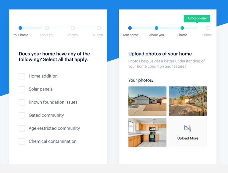
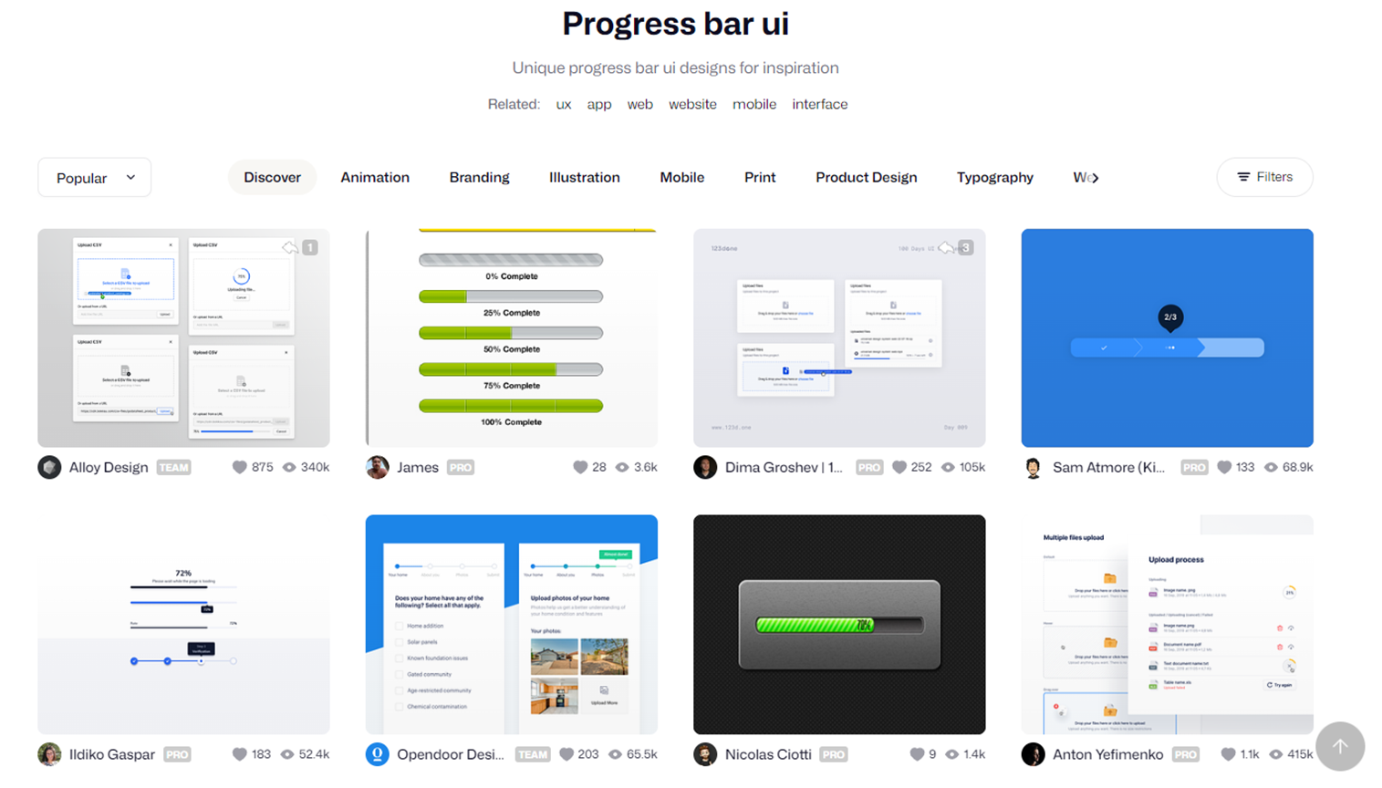
2. Make the user feel in control
Give your user lots of indications of what to expect so that they feel in control, such as ‘this will take around 10 minutes’, or a progress bar so they know how many steps they’ve got to follow. Also, make sure buttons have descriptive actions. Rather than ‘submit’, consider ‘submit to manager for approval’ so they know exactly what to expect when they click it.
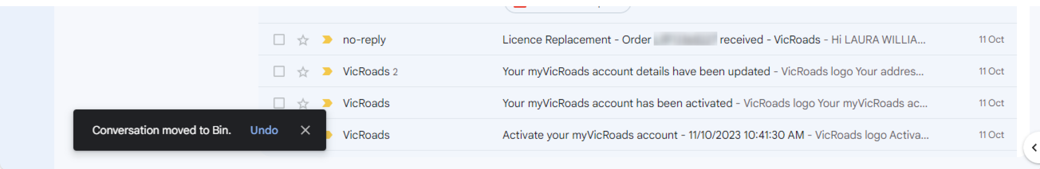
3. Include enough feedback
Whenever the user interacts with something, they expect a reaction, or ‘feedback’. This helps the user to realise their action was successful. For example, when they click a button, an animation should indicate that it successfully clicked. If a form is submitted, a ‘thanks for your help’ message affirms that their information was submitted. Also, be specific with error messages, a useless ‘error has occurred’ message is very frustrating.
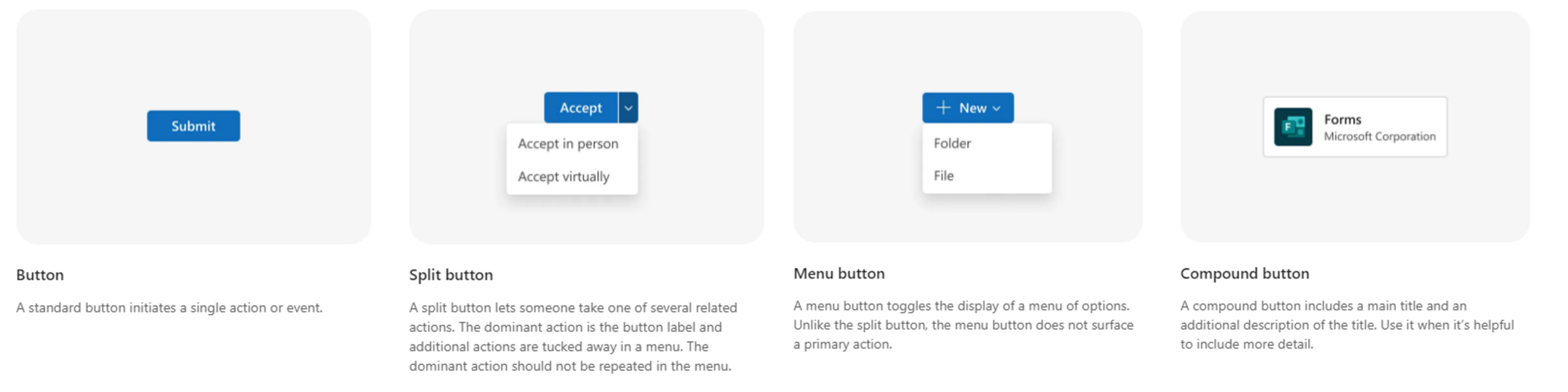
4. Consistency
Choose your style and stick with it! This doesn’t just mean the look and feel – make sure that the behaviour is consistent too. For example, all pop-up modals should be the same, menus should always be in the same place, links should open in the same way. A coherent design promotes familiarity and users will know what to expect and ‘learn’ as they move around in your solution.
5. Don’t make users work (or squint)
Fitt’s law is how far the user has to move their mouse to the target area divided by the size of the target. The longer the distance and smaller the target, the longer it takes. Consider your user’s most frequent journeys around the page, for example if they need to click they approve and then click submit, keep these actions close together.
Also think about the flipside of this point. You want to keep delete and cancel buttons out of easy reach!
6. Visual hierarchy
What is the number one action that you want the user to do or the most important thing on the page? This should be the first thing you notice on the page. Use size, colours, contrast, fonts and spacing to prioritise content and actions.
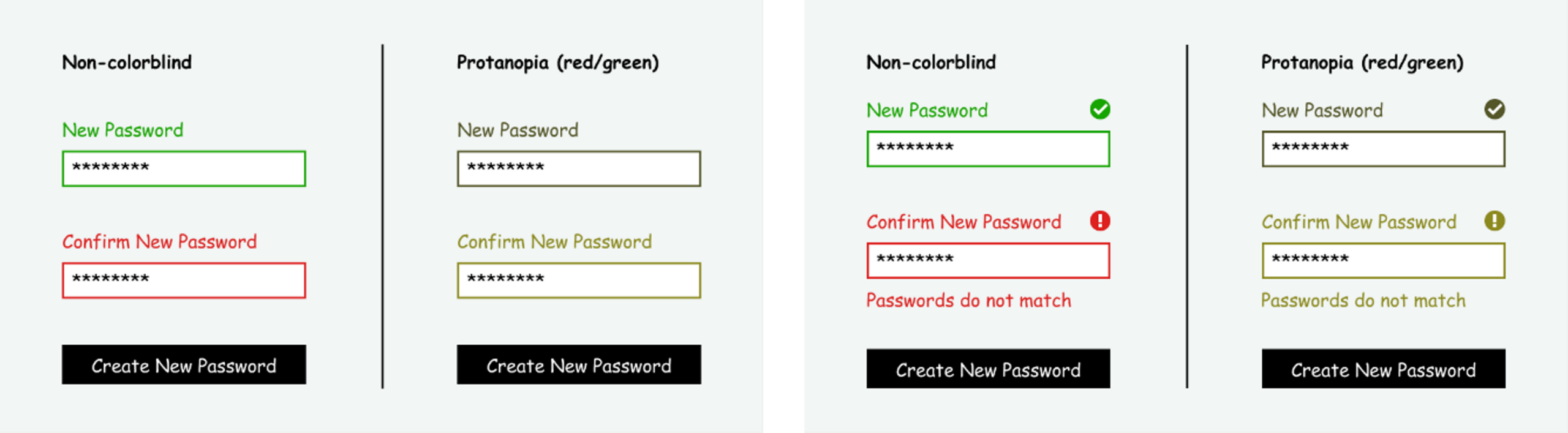
7. Accessibility
Consider the diverse set of users using your solution. You may be working against accessibility standards, but even if it’s not specified, check out the WCAG 2.0 Level AA guidelines to create inclusive designs. Recommendations include avoidance of idioms and jargon, not using colour as a way of conveying information in case of visual impairments and having text alternatives to images for screen readers.
8. The art of stealing
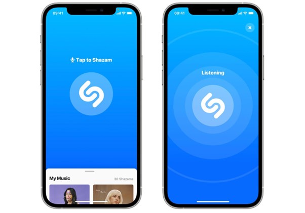
Can’t think how to squeeze in a menu on your app? Browse the top design systems, Dribble search for ‘menu ui design’ and flick through. Look through all of your favourite apps on your phone to see how they do it. Some of the best UX out there are apps you installed and knew how to use them without a second thought, such as Spotify, Amazon and ABC News. Get inspired – the biggest companies in the world have gone through extensive usability testing and trial and error so you don’t have to.
9. Don’t break convention
As much as design is all about creativity, there are certain things in design that you just don’t mess with. Take advantage of the fact that the whole world understands things such as burger menus on mobile, logo placement and log in buttons.
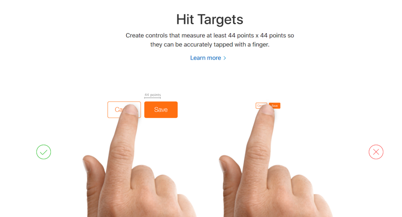
10. Touchscreen target sizes
If designing for mobile, remember those people with the fat thumbs. Smaller touch targets make all users work harder because they need more accuracy to hit them. Create controls that are at least 44 x 44 pts and with centres at least 60pt apart. Users get frustrated when they accidentally hit the wrong buttons and have to go back, and they can move quickly through their task if they can hit clear buttons easily.
About the author
Laura Williams is a UX Consultant at Engage Squared with 7 years experience applying UX principals to Microsoft technologies. She has a strong passion for crafting intuitive and beautiful experiences that people enjoy using, she is dedicated to aligning people’s work technology with their everyday digital interactions. Laura’s mission is to design effortless systems, allowing users to concentrate on their tasks without any burdening thoughts into how the interface works.
Laura is based in Byron Bay where she spends a lot of time in the ocean. Outside of the office, you can find her on camping adventures or cooking with her chef boyfriend.