Published 29 May 2024
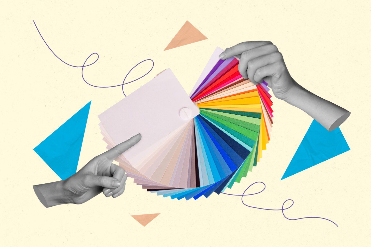
As a Digital Designer, it makes me excited to see SharePoint making significant strides in the design space. For so long we have been limited by colour, fonts, and a strict grid structure to our SharePoint pages.
This has been great for maintaining a simplified design, but employees have high expectations for engaging and beautiful digital experiences, and it’s important for organisations to maintain brand consistency through a unified space. Imagine logging into your organisation’s intranet and being greeted by a stunning, vibrant design that feels like a natural extension of your company’s brand and culture. It’s not just a pretty interface; it’s a game changer! Here’s why:
- First impressions matter.
A beautifully designed intranet makes an instant impact. It demonstrates investment in your employees and shows your organisation cares about its digital workplace and the digital employee experience as much as the physical workplace and the customer experience. - Boosts engagement.
No one wants to navigate a clunky, outdated intranet. A sleek, modern design will encourage your employees to actually use the intranet, making it a hub of activity where people want to share, connect, collaborate, and stay update. - Reflects culture.
Your intranet should feel like your organisation – when your employees log on, they should immediately recognise it as ‘theirs’ (or, even better, ‘ours’!). Whether it’s through the use of your brand colours, logos or unique design elements that reflect your company’s vibe, a well-designed intranet reinforces your brand and culture. - Enhances user experience.
Good design isn’t just about good looks, it’s also about usability. An intuitive, visually appealing intranet makes it easier for employees to find what they need, when they need it, quickly and efficiently, helping boost productivity and reduce frustration.
In a nutshell, a beautifully designed intranet is the ultimate team player – it reflects your organisation’s identity, fosters a sense of community, engages your employees and shows them they’re valued. It’s not just design – it’s a statement.
With all that in mind, when I read Microsoft are ‘expanding the aesthetic capabilities of SharePoint to empower you to make pages and sites that are bolder and more sophisticated than ever before’, my heart skipped a beat!
Let’s dive into the awesome new design options and brand centre released by Microsoft for SharePoint Online and how they can help organisations achieve that fantastic intranet experience we’re all looking for.
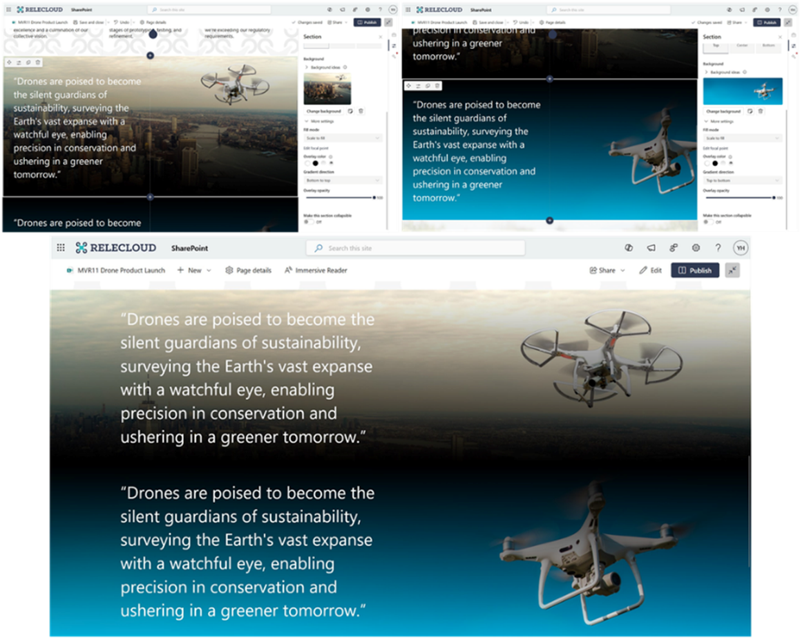
Custom section backgrounds
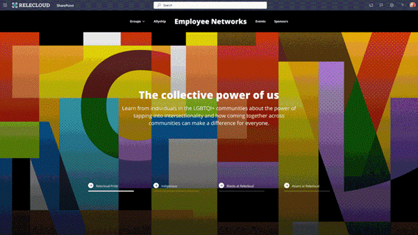
An exciting new feature in SharePoint is the ability to add a custom image or a gradient colour to a page section background. There are a bunch of new settings to play with like fill mode, overlay colour and overlay opacity that gives users the ability to push the boundaries of their design, all whilst following accessibility best practices. Organisations will now be able to inject more of their brand identity into their pages through graphic textured backgrounds, branded images and more colour options, enabling you to create more dynamic, inspiring page layouts that help people engage with your content with designs that aren’t just a pretty face, but are also user-friendly.
Advanced image editing
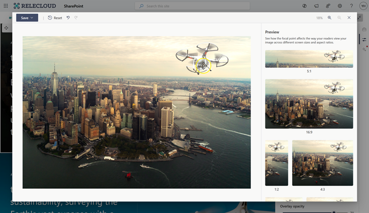
Similar to the custom section backgrounds, SharePoint has improved the editing capabilities of images with a new advanced image editor tool. We now can edit the shape of images, crop images, adjust colours, add filters, and overlay text all directly within SharePoint.
The enhanced focal point setting experience is also a very useful feature allowing content editors to select a focal point of the image and see how different readers will view the image across different screen sizes and aspect ratios.
Brand managers and graphic designers will particularly appreciate this update, as they can now share a collective sigh of relief, long gone are the days where the focus of the image gets lost when the screen size is reduced!
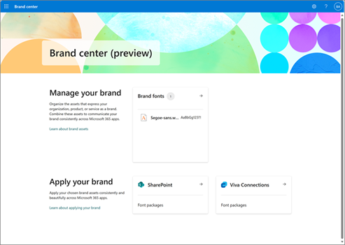
SharePoint Brand Centre
Currently in preview, Microsoft’s latest tool – the SharePoint Brand Centre is our design and brand team’s dream come true. The SharePoint Brand Centre keeps all our brand assets in one central spot, making sure that everyone (yes, everyone) uses the correct version. No more branding mix ups, no more wasted time looking for the right brand assets and more time getting back to the work that matters!
Designed to streamline every aspect of brand management, the SharePoint Brand Centre app simplifies the organisation of your brand assets including colours, fonts, images, voice and guidelines, organisation asset libraries and permissions. It’s the go-to spot for brand managers to access and manage these assets from one central location, ensuring brand consistency and helping in creating high-quality branded content with ease, avoiding duplication and confusion. Whether you are updating a logo or PowerPoint template, everything is in the one spot!
Here are two great ways to make an impact with SharePoint Brand Centre
1. Enforce brand guidelines
By enforcing branding guidelines, the Brand Centre ensures all sites adhere to the same visual standards, making it easier for organisations to maintain a cohesive brand presence and helps site owners authentically represent their organisation’s identity, fostering a stronger connection with users.
2. Enable custom fonts
One of the most anticipated new features is the introduction of custom fonts. Turning on the Brand Centre automatically gives you the ability to change your font on your SharePoint site. You can load your brand’s own custom font or use one of Microsoft’s default font packages.
Something to keep in mind: There is currently no way to restrict access to certain security groups. If your organisation uses different fonts across affiliated companies, the global marketing team needs a communication strategy to ensure proper implementation.
Another thing to consider is that custom fonts have not yet rolled out to all web parts, so we recommend you make sure you’re happy with the look of your custom font when viewed alongside the SharePoint default font, Segoe UI, as this can have a huge impact on the overall look of your site.
What’s next?
At Engage Squared, we’ve had the privilege of exploring some of the above new features in SharePoint’s Preview. However, this is just the beginning of what SharePoint plans to introduce in the coming year. The new SharePoint experience aims to encompass all aspects of exceptional web design, focusing on branding and theming, typography and fonts, grid and layout, video and imagery, as well as animations and motion. This approach will significantly enhance the platform’s design capabilities enabling us to push the boundaries of creativity while maintaining operational efficiency.
I’m looking forward to seeing how these changes are going to redefine the intranet experience, empowering organisations to easily create SharePoint sites that are visually engaging for their users. What are you the most excited about and will be wanting to implement?
For more insights and tips on leveraging SharePoint, subscribe to our newsletter or reach out to our team today. Let’s keep your brand looking sharp and professional!
About the author
Gemma Kitto is an experienced Digital & UX Designer with over 12+ years’ experience developing design solutions with the user in mind.
Gemma is dedicated to understanding user behaviour and using this to apply a user-centric approach to projects. She creates authentic and modern design concepts, with a keen eye for detail.