Dentsu Creative is a leading advertising media company across ANZ who pride themselves in “transforming brands and businesses through the power of modern creativity”.
Client
Dentsu Creative
Industry
Advertising
Organisation Size
Medium
Country
Australia
Technologies
SharePoint Online
Service
Digital Workplace
Context
Having delivered beautifully designed projects for their own clients, Dentsu Creative was aware of the importance branding has and the connection it provides by engaging staff within an organisation.
With their existing intranet in need of an upgrade – both aesthetically and functionally – Dentsu Creative’s mission was to launch a modern SharePoint Online intranet to their staff across Australia, focussing largely on bringing their Sydney and Melbourne cohorts together via a shared online space that visually represented who they were digitally. The guiding principle for their new intranet was simple: “Make me want to use it”.
With their sister company successfully launching their intranet using Engage Squared, we were delighted to build a brand-new SharePoint Online intranet for Dentsu Creative using the same approach but tailoring the usability and design to their unique needs.
The challenge
The benefit of having sister companies is seeing what worked successfully and adapting their approach to suit your own organisation. For Dentsu Creative, their sister company had recently launched a brand-new SharePoint Online intranet, built by Engage Squared, with great success. Creatively it was on brand, the architecture made documents easy to find, and mostly importantly employee feedback was positive. For Dentsu Creative, it made the requirements of their own SharePoint Online intranet easy when chatting with us – “We’ll take exactly what they had.” Whilst our digital workplace practice was delighted with the request, they knew that the discovery phase would uncover their own set of unique requirements and a one size fits all approach rarely fits.
From chatting in depth with the Dentsu Creative team, their own key objectives soon became clear:
- Scale: It was important that their new intranet could meet their future needs and scale as the business continued to grow and evolve. This included bringing their New Zealand employees into the same digital experience in the next project phase.
- A desktop first approach: Dentsu Creative were aware that most of their employees would use the intranet via their desktop to access documents throughout a working day. This meant unlike other apps or solutions which consider a mobile first approach, their intranet should prioritise the accessibility and usability of desktop.
- Visually appealing: Being a highly successful creative agency, Dentsu Creative were aware of the importance of branding and wanted their own digital front door to act as an extension of who they were.
- Connection: Uniting people from various geographic locations across Australia to feel part of one team was crucial to the success. This included connecting employees to ‘how-to-guides’ for easy onboarding of employees, clients, and suppliers.
With their challenges understood, our Digital Workplace practice began approaching this project with Dentsu Creative’s request always front of mind:
Our solution
To begin, we ran a series of workshops to dive further into the wants and needs that Dentsu Creative wanted to address. These workshops included: Vision and Success, Requirements, Design, and IA. With learnings identified and objectives set, our team worked closely with their project team to build a fit for purpose and aesthetically beautiful SharePoint Online intranet that suited the needs of everyone.
Key features included:
Addressing scale
With an investment in M365 already in place, a largely OOTB SharePoint intranet was the obvious choice, with the exception of using Modern PnP Search. PnP was used across several areas surfacing the ability for end-users to quickly search and find key content to support their core business – pitching and winning proposals. This included archive document libraries where employees can filter by industry and document type, which allows their people to access a growing wealth of knowledge and help with locating documents faster.
Our administration guide, and information architecture report, detailed the use of managed metadata and how the PnP searches were set up so the team can easily replicate similar searches across their intranet as they need to.
Finding key information to support onboarding
A key purpose of their new intranet was to support new starters, along with the ease of onboarding new suppliers and clients. A “How do I?” search vertical was implemented across every site, supporting end-users who are required to search for key operational documents to support with onboarding and other processes.
Connection
Introducing News and Events was a new concept for Dentsu Creative and was added to address the communication across offices. We found a unique way to use the ‘news digest’ feature to support them in their monthly ‘Hour of Power’ sessions (similar to a Town Hall). For those with editor access, they could create the news digest content and form the agenda for their whole of company meeting, creating efficiencies to the nominated employee who is required to host the meeting for the month.
Embodying the brand
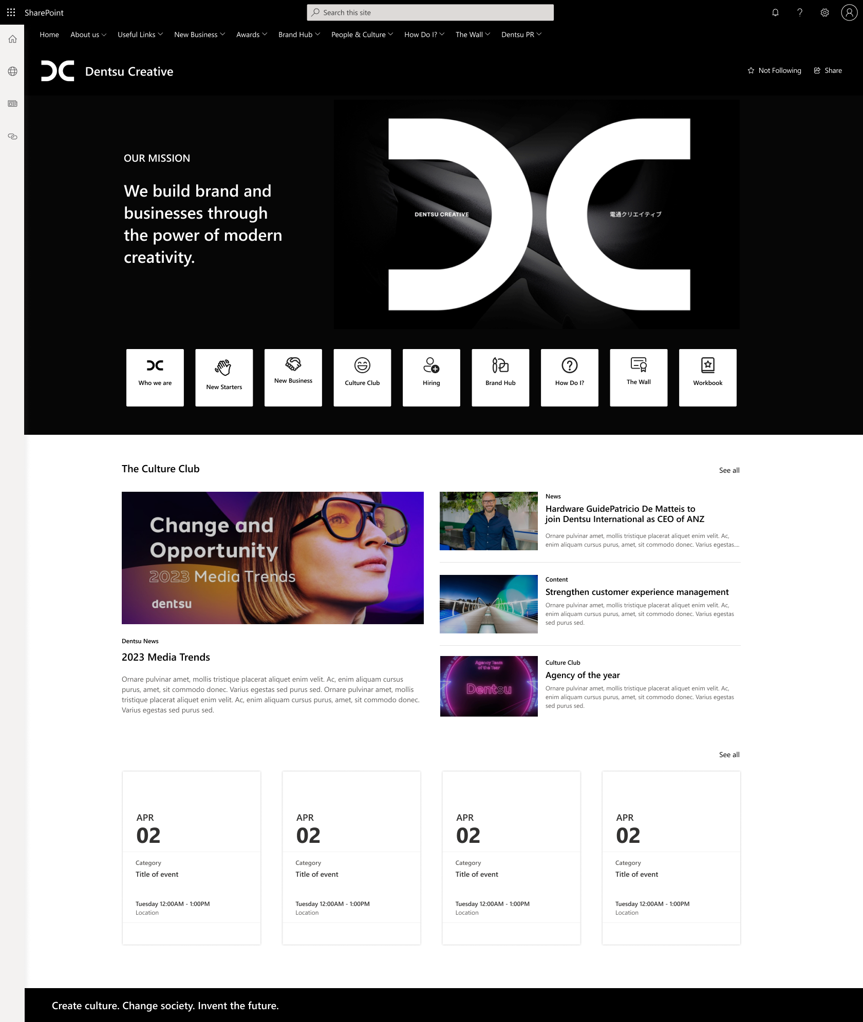
As a creative agency, it was crucial for their intranet to reflect their agency’s ethos and embody creativity. We achieved this by incorporating a bold brand presence through a striking colour palette of black and white. To maintain a clean and streamlined appearance, we kept everything else minimalistic and simple, allowing their creative work to shine.
We were also able to bring an element of the physical offices into the digital workplace by supporting unity and connection. As part of the build, a site called “The Wall” was included as a place to share work and celebrate wins. This concept was derived from their “Little Wall of Big Problems” which exists in both the Dentsu Creative Sydney and Melbourne offices.

The result
As a creative agency, the stakes were high in delivering an intranet that would meet the requirements of a team with high expectations. We are delighted that the overall feedback from the leadership team on the design and functionality was positive.
The improved usability and access of Dentsu Creative’s new intranet has been the hero of this project and included:
- The ability to showcase work on their site ‘The Wall’ has allowed the team to find resources with ease and has saved them when planning their award entries.
- The SharePoint Online capability in the editor team has helped their culture ambassadors publish news, updates from their social activities and unleash their inherent creativity to draw employees to the intranet.
- The unique use of the news digest for the ‘Hour of Power‘ have created efficiencies for the host of those meetings, and ensure messaging is consistent with what has been published on the intranet.
Proof that what we designed and delivered was universally loved? Other brands within the wider Dentsu agency provided feedback that they could also benefit from our assistance. Watch this space.


